While writing this column for the Ottawa Citizen on proposed changes to Canada’s immigration policy, an idea occurred to me that had taken years to crystallize. It emerged, strange but sharp, like a thorn buried under the skin that slowly eases free of the body’s confines.
Immigration is an information design problem.
I’ve tackled immigration before: as an immigrant from the US to Canada, I felt compelled to write a design thesis on the future of border security. I joined the Border Town Design Studio, and installed an interactive art experience about border security at the Detroit Design Festival in 2011. I wrote a story called “By the Time We Get to Arizona,” about gamifying immigration and infrastructure-as-surveillance, for Project Hieroglyph. Now I’m working on a transmedia experience on human trafficking and migration for the World Bank’s EVOKE project. Writers have themes, and this one of mine. Because immigration (and border security) is a wicked problem, I think tackling the issue from a bunch of different angles is the best way to go. Also, I think proposing solutions and starting a conversation — no matter how that conversation ends — is better than just whining about a problem. That’s also why I love science fiction so much: it imagines alternatives to our lived experiences in a way that we can share and discuss with other people. This is especially important when the alternatives look pretty grim.
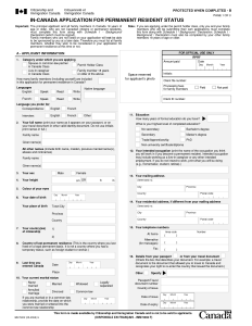
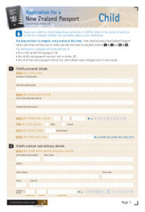
But border security is only one half of the problem. The other half is immigration itself — a process that even when done legally is a nightmare of forms, stamps, fingerprinting, questionnaires, lost forms, interviews, urine tests, X-rays…and checklists. Endless checklists. All done on sheets of paper that look like this:
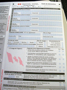
 Compare that to the customs form:
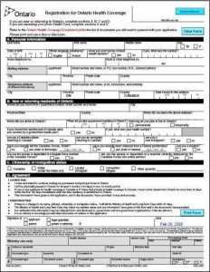
Or even the Ontario Health Insurance Plan application:
While no one would call the latter two forms particularly attractive from an aesthetic perspective, from an information design perspective they provide affordances to the user that are necessary. Different sections of the document are broken up by thick lines and shading. There is a single column of information that extends vertically, rather than a split-column that distracts the eye and tricks the user into filling in parts out of order. These elements make the document more legible and more useful. They provide visual cues to the user as to how to organize and relate information. By contrast, the immigration document asks about a variety of subjects (marital status, education, past addresses) without signposting any particular changes. Every new question is a new box in your closet that you have to open. Literally.
When I first applied to become a permanent resident of Canada, the officials in charge of my file lost my documents. When I got them the new documents they asked for, they claimed my new documents didn’t match my old ones. “Were the documents there this whole time?” I asked our lawyer. “Were they trying to trip me up? Or did I just make a mistake on one of the sets?”
Both explanations are possible, and given the illegible, user-unfriendly design of the documents, I wouldn’t be surprised if plenty of other applicants make mistakes. I mean, if the voters of Florida can be flummoxed by hanging chads, might not immigrants who speak English as a second language be a trifle confused by a series of pages that blur together? These are small things, until the moment they’re not. Until the moment your ability to re-unite your family depends on them.
So why can’t we do better? In the past twenty years, technology has revolutionized the entire landscape of interaction, interface, experience, and information design. Designers in these fields offer new strategies for visualizing everything from online shopping to online banking to online tax filing to methods for measuring how many steps you’ve taken today or who you want to sleep with. Even as you read this website (and thank you for visiting), someone else is in a meeting discussing how to improve its backend content management system. Sometimes these changes are awful (Kinja). Other times, they’re great (Wired). Either way, the end goal is to make things easier on the user, so that the user can share information with the system more quickly and efficiently. After all, the trackers attached to your favourite websites can’t mine your data if you never use the website. You have to stay there. So they make it nice for you to stay there.
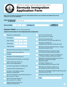
If iPads are simple enough for toddlers to use, why are some of the most important documents we’ll ever fill out…so tough to fill out? Wouldn’t the time lost to mistakes on the applications be better spent processing more applications? What if our immigration applications looked more like this?
 See that? The colours? The big, friendly letters? The clear signposting about who the document pertains to? The clearly defined areas of the document?
Bermuda gets it. Why can’t we?
The proposed changes to Canada’s immigration policy strive for total information awareness — a free flow of data between the immigration burea, the revenue agency, the nation’s police force, its border security agency, and its employment agency. The CIC claims that fraud is too pernicious, and mistakes too frequent, and that requesting applicants for more information is simply too time-consuming. But what if the process by which they gathered that information was easier for both parties? What if basic changes to fonts, colours, weights, and organizational flow could ensure fewer mistakes?
As it turns out, I’m not the only one who’s had this thought. In 2010, the Consumer Financial Protection Bureau responded to America’s ongoing mortgage crisis by hosting a symposium on how to prevent further damage. A design firm called Continuum responded by re-designing mortgage application forms to make them more legible and useful for applicants. With the improved designs, they argued, applicants would have a better sense of whether they could truly afford the mortgage they were applying for. Armed with that knowledge, they were less likely to default. Quite aside from issues of privilege, access, and systemic poverty — the very same issues that influence immigration patterns — improving basic legibility was seen as a first step that could help every applicant and make the process fairer and more equitable for everyone.
I bring this up because we don’t have very long to fix this problem before it becomes an even more massive violation of privacy than it already is. If and when this proposed system fails, the solution that takes its place could be even worse. After all, if the CIC were really so concerned about accuracy, they wouldn’t be picking through multiple data sets from multiple organizations, checking them against each other. (The only thing that will do is create a new class of tax accountants-cum-immigration lawyers, tasked with keeping stories straight.) But what if the CIC expected you to export your LinkedIn profile to their file on you? Or your bank statements? Or your TurboTax returns? Or even the results of your most recent physical? Granted, many immigrants may not have those same data profiles on hand. But in ten years, when some of these brands have achieved even deeper global market penetration, it starts looking more likely.
And keep in mind, immigration authorities ask for all that information already. They ask you for your employment history, evidence of your financial security, and whether you’re pregnant. And that data is already for sale to the highest bidder. It’s just sitting there, neat and tidy and organized, freely given, just a tickbox away. Already user-friendly. So convenient. So easy to leave on, so that every adjustment was instantly reported back, authorities hiding behind brands, guns holstered in platforms. How long do we really have before governments everywhere realize they can cut costs by scraping that data? That they don’t even need immigration officers to do a job that marketing algorithms do all day, every day? When will the immigration process stop merely feeling like a judgment handed down by an unfeeling machine, and become exactly that? And, for that matter, what’s to stop other agencies from doing the very same thing? Adoption bureaus looking at the type of lube you like. Auto insurance providers asking why you’ve watched Fast & Furious so many times on Netflix. It’s all possible. And the only thing that might stop it is if we find a better way to design and share information amongst ourselves, rather than relying on a platform to do it for us.
Wouldn’t it be better just to re-design some forms?
